Intro
Thanks to BrendaSo for posting this neat and tidy air pollution data. This data set got me interested in plotting some different air pollutants in Charleston, SC over the past several years.
First here’s some code to read the full data set and get the parts I’m interested in.
pol_sc <- read_csv("pollution_us_2000_2016.csv") %>%
  filter(State == "South Carolina") %>%
  select(-c(X1,`State Code`,`County Code`,`Site Num`,State,City)) %>%
  mutate(Date = `Date Local`) %>%
  filter(substr(Date,1,4) >= 2006)
Below are time series plots showing daily averages of pollutant concentrations for a selection of different air pollutants, with points colored by EPA’s Air Quality Index for that day.
pol_sc %>%
  filter(County == "Charleston") %>%
  ggplot(aes(x = Date, y = `O3 Mean`, color = `O3 AQI`)) +
  geom_point(alpha = 0.25) +
  scale_x_date(date_breaks = "6 months",date_labels = '%b %Y') +
  theme(panel.background = element_rect(fill = "white"),
        text = element_text(family = "serif"),
        axis.text.x = element_text(angle = 35)) +
  scale_color_viridis() +
  ggtitle("Plot of ozone mean over time in Charleston County, SC") +
  labs(subtitle = "Points colored by associated O3 Air Quality Index") +
  ylab("Mean O3 in ppm")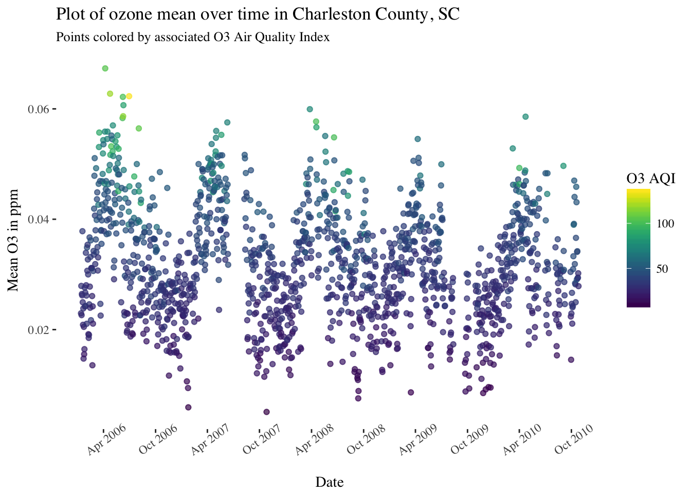
pol_sc %>%
  filter(County == "Charleston") %>%
  ggplot(aes(x = Date, y = `NO2 Mean`, color = `NO2 AQI`)) +
  geom_point(alpha = 0.25) +
  scale_x_date(date_breaks = "6 months",date_labels = '%b %Y') +
  scale_y_continuous(limits = c(0,10)) +
  theme(panel.background = element_rect(fill = "white"),
        text = element_text(family = "serif"),
        axis.text.x = element_text(angle = 35)) +
  scale_color_viridis() +
  ggtitle("Plot of NO2 mean over time in Charleston County, SC") +
  labs(subtitle = "Points colored by associated NO2 Air Quality Index") +
  ylab("Mean NO2 in ppb")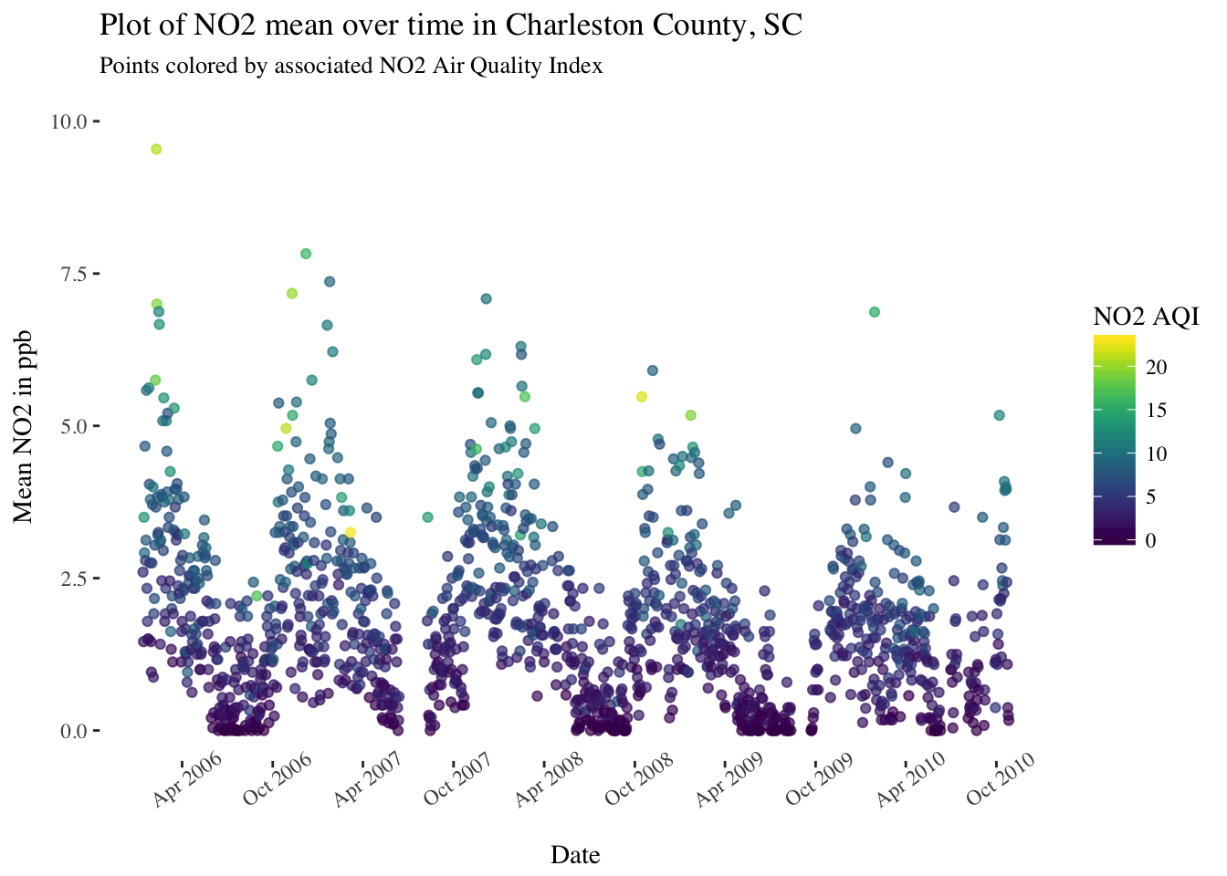
pol_sc %>%
  filter(County == "Charleston") %>%
  ggplot(aes(x = Date, y = `SO2 Mean`, color = `SO2 AQI`)) +
  geom_point(alpha = 0.25) +
  scale_x_date(date_breaks = "6 months",date_labels = '%b %Y') +
  theme(panel.background = element_rect(fill = "white"),
        text = element_text(family = "serif"),
        axis.text.x = element_text(angle = 35)) +
  scale_color_viridis() +
  ggtitle("Plot of SO2 mean over time in Charleston County, SC") +
  labs(subtitle = "Points colored by associated SO2 Air Quality Index") +
  ylab("Mean SO2 in ppb")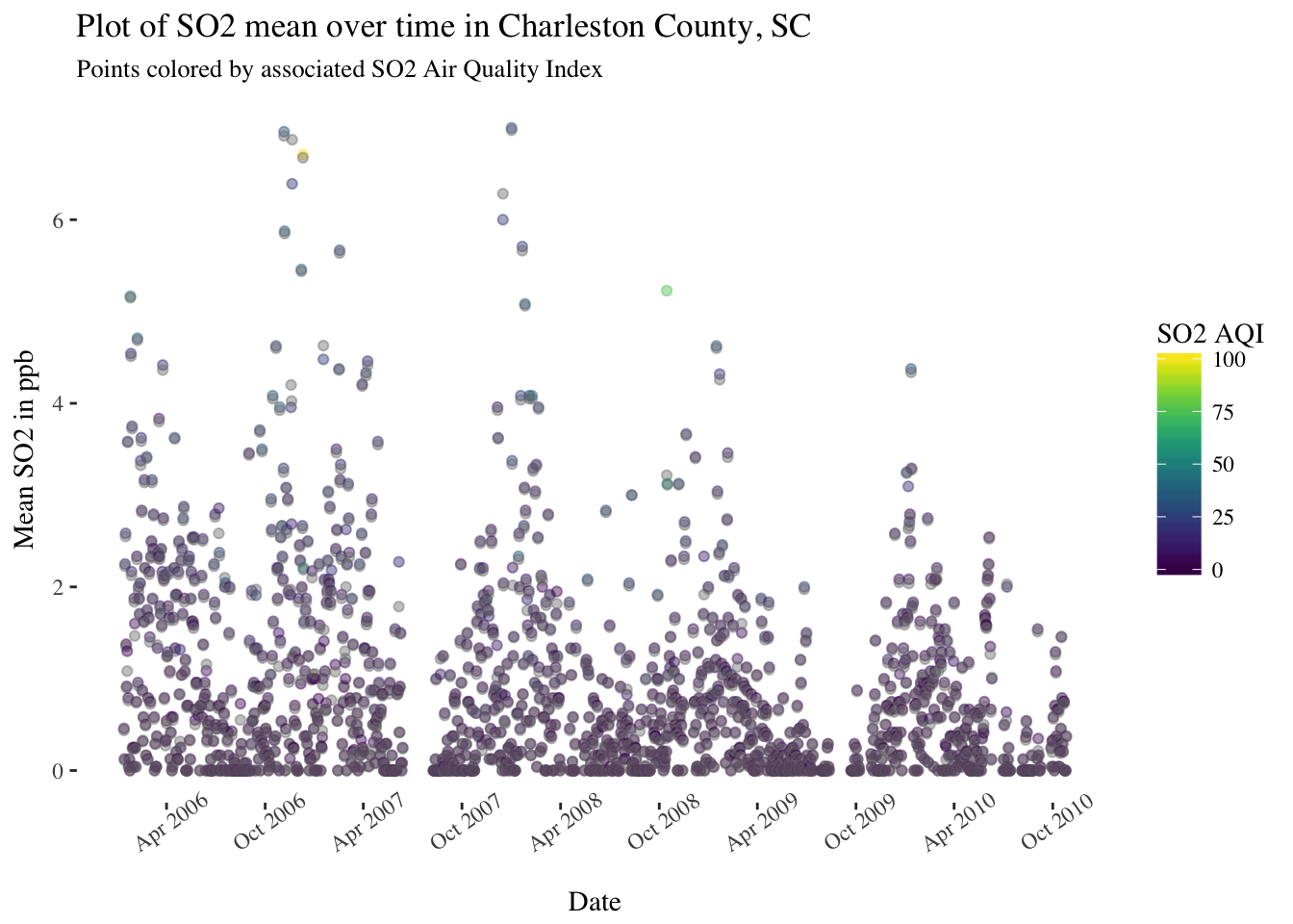
pol_sc %>%
  filter(County == "Charleston") %>%
  ggplot(aes(x = Date, y = `CO Mean`, color = `CO AQI`)) +
  geom_point(alpha = 0.25) +
  scale_x_date(date_breaks = "6 months",date_labels = '%b %Y') +
  theme(panel.background = element_rect(fill = "white"),
        text = element_text(family = "serif"),
        axis.text.x = element_text(angle = 35)) +
  scale_color_viridis() +
  ggtitle("Plot of CO mean over time in Charleston County, SC") +
  labs(subtitle = "Points colored by associated CO Air Quality Index") +
  ylab("Mean CO in ppm")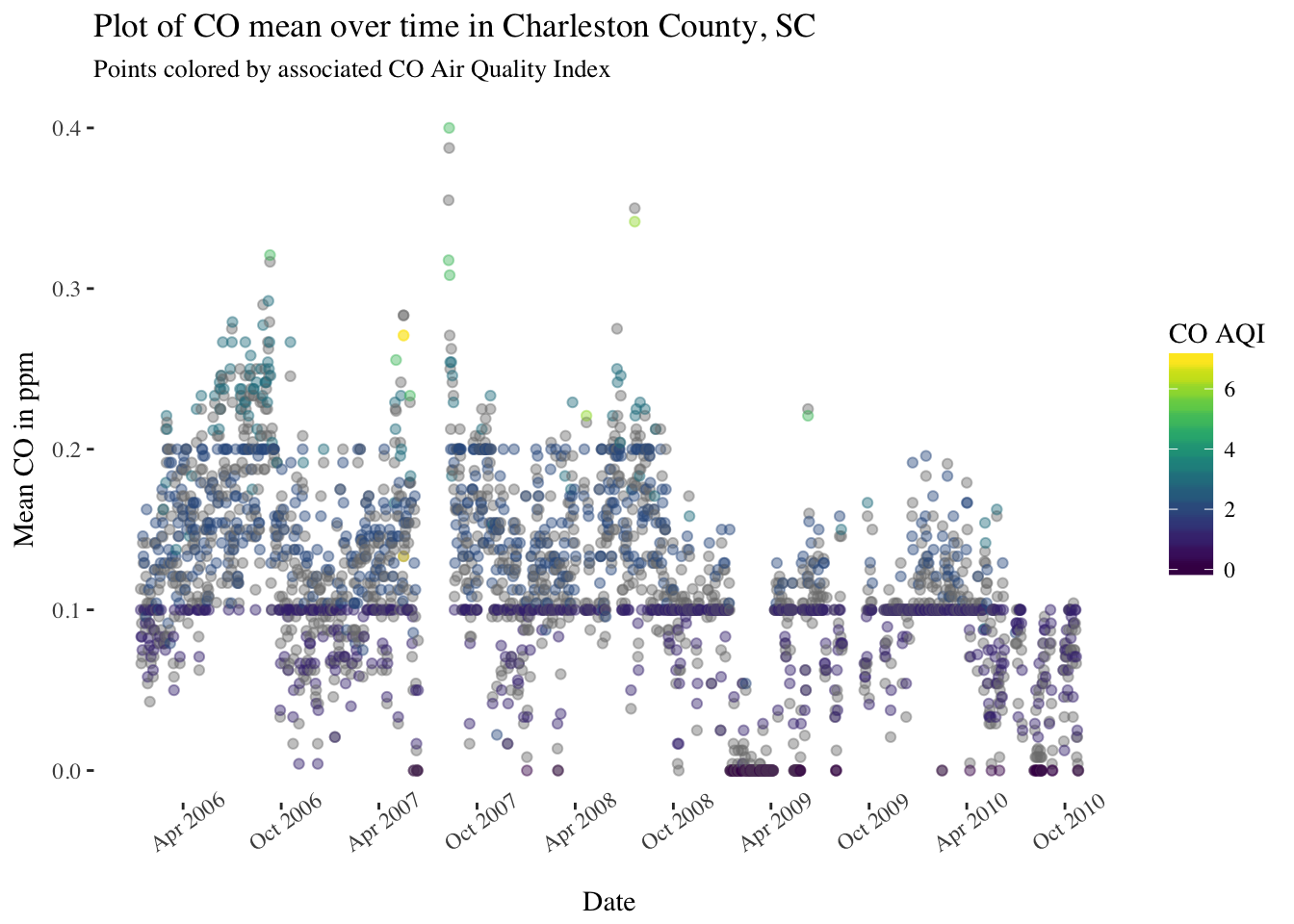
There are definitely some seasonal trends in most of these pollutants and some interesting patterns to look into further.
ARIMA Modeling
Let’s take another look at the ozone daily averages from 2006 to 2010 (code not shown again).

There is definitely a seasonal trend to the pattern, and possibly a very slight overall downward trend for the entire series. Since a (first order) autoregressive model requires a (weakly) stationary process - one with constant mean, constant variance, and constant \(Cov(x_i,x_{i-h})\) for all \(i\) - I’ll first make an attempt at de-trending this series.
One way to de-trend is to fit a simple linear model of the mean over time, and then subtract the mean from each daily average and plot the result. First let’s fit the linear model, which would look like this: (Note the assumptions for simple linear regression will be violated here, but I am not using this model for any direct inference!)
pol_sc %>%
  filter(County == "Charleston") %>%
  ggplot(aes(x = Date, y = `O3 Mean`, color = `O3 AQI`)) +
  geom_point(alpha = 0.25) +
  stat_smooth(method = "lm") +
  scale_x_date(date_breaks = "6 months",date_labels = '%b %Y') +
  theme(panel.background = element_rect(fill = "white"),
        text = element_text(family = "serif"),
        axis.text.x = element_text(angle = 35)) +
  scale_color_viridis() +
  ggtitle("Plot of ozone mean over time in Charleston County, SC") +
  labs(subtitle = "Points colored by associated O3 Air Quality Index") +
  ylab("Mean O3 in ppm")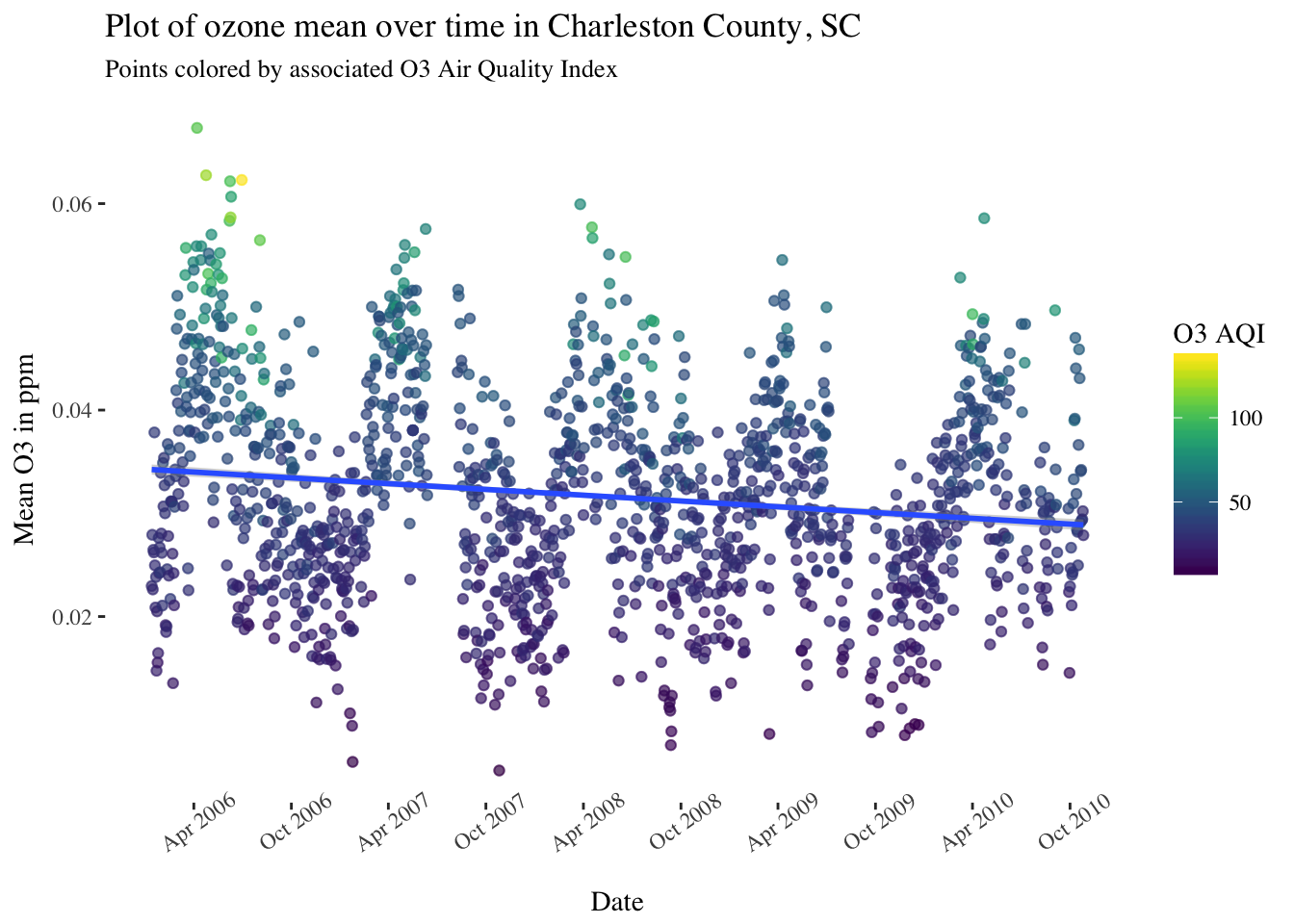
It seems that the simple linear model has identified a gradual downward trend. An overview of the model parameters:
y <- pol_sc %>%
  filter(County == "Charleston") %>%
  pull(`O3 Mean`)

x <- 1:length(y)
O3_slr <- lm(y ~ x)
broom::tidy(O3_slr)## term estimate std.error statistic p.value
## 1 (Intercept) 3.429074e-02 2.589202e-04 132.43747 0.000000e+00
## 2 x -8.709283e-07 7.498440e-08 -11.61479 7.418815e-31Now with the fitted values, we can compute \(d = y_{observed} - y_{fitted}\).
d <- y - fitted(O3_slr)Now let’s plot the dentrended daily averages and first order differences.
first_diffs <- c(0,diff(y))
detrended_tbl <- as_tibble(cbind(x,d,first_diffs))
ggplot(data = detrended_tbl, aes(x = x, y = d, color = first_diffs)) +
  geom_point(alpha = 0.15) +
  scale_color_viridis() +
  theme(panel.background = element_rect(fill = "white"),
        text = element_text(family = "serif")) +
  ggtitle("Detrended daily ozone averages") +
  labs(subtitle = "Colored by 1st order differences") +
  xlab("Series index") +
  ylab("Detrended ozone average")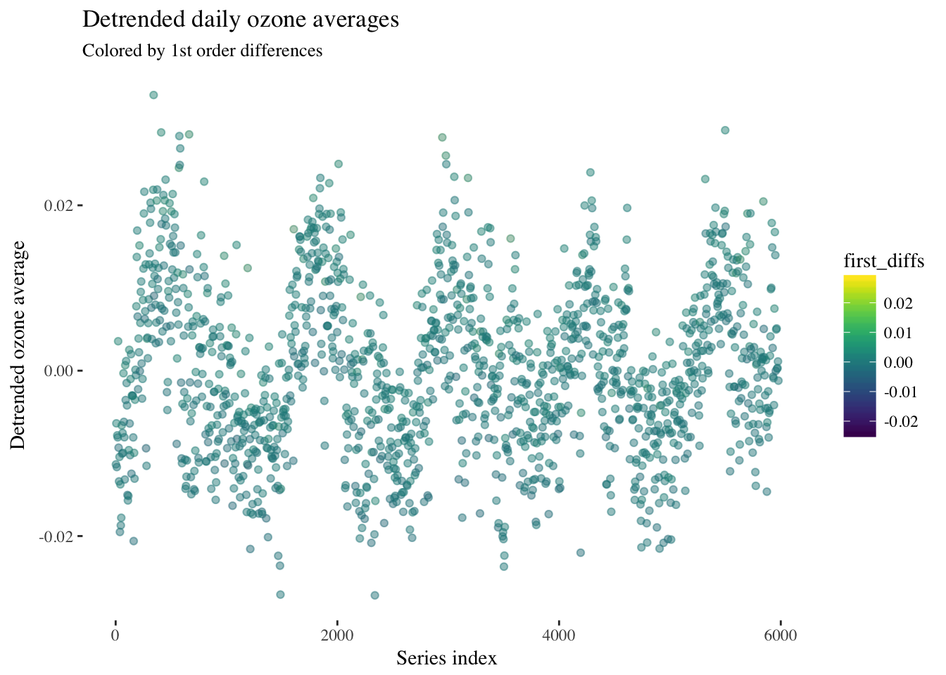
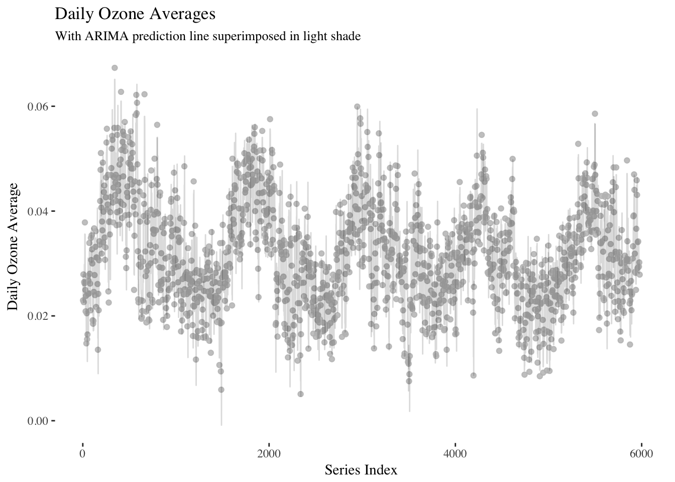
It looks like the first order differences are constant over time, so a first order ARIMA model could be appropriate here.
library(forecast)
ar_mod <- Arima(ts(y,frequency = 12),
                order=c(1, 0, 0),
                seasonal=list(order=c(2, 1, 0),
period=12))ar_mod## Series: ts(y, frequency = 12)
## ARIMA(1,0,0)(2,1,0)[12]
##
## Coefficients:
## ar1 sar1 sar2
## 0.8782 -0.7347 -0.3618
## s.e. 0.0062 0.0121 0.0121
##
## sigma^2 estimated as 1.748e-05: log likelihood=24216.5
## AIC=-48424.99 AICc=-48424.99 BIC=-48398.22fit_tbl <- as_tibble(cbind(x,y,fitted(ar_mod)))ggplot(data = fit_tbl, aes(x = x, y = y)) +
geom_point(alpha = 0.35,color = "grey") +
geom_line(aes(x = x, y = `fitted(ar_mod)`),alpha = 0.15) +
scale_color_viridis() +
theme(panel.background = element_rect(fill = "white"),
text = element_text(family = "serif")) +
ggtitle("Daily Ozone Averages") +
labs(subtitle = "With ARIMA prediction line superimposed in light shade") +
xlab("Series Index") +
ylab("Daily Ozone Average")