Intro
The early 90’s series Twin Peaks by David Lynch and Mark Frost is probably my favorite show of all time. The show’s eerie blend of humor in the midst of sorrow and clash between characters of pure good and pure evil make the show so unique. After working through a copy of Text Mining with R by Julian Silge and David Robinson, I decided to try to get my hands on copies of the transcripts of Twin Peaks episodes to apply some newly learned tidytext principles. My main goal going into this project was to try out some simple sentiment analysis on these episode transcripts and see if there are any unexpected trends.

The Data
Not surprisingly, I was able to find digital copies of Twin Peaks transcripts online. I downloaded each transcript as a text file and read each into R with the readLines() function. Since I eventually wanted to get into sentiment analysis, I loaded the tidytext package along with tidyverse. I chose to use the AFINN lexicon because of its nice numeric scale ranging from -5 (most negative) to 5 (most positive). Below is the dplyr chain for tidying the data from the pilot episode.
e0 <- readLines("http://www.glastonberrygrove.net/texts/pilot.html") %>%
  as_tibble() %>%
  unnest_tokens(word,value) %>%
  anti_join(stop_words) %>%
  count(word,sort = TRUE) %>%
  filter(word != "cut") %>%
  inner_join(get_sentiments("afinn")) %>%
  mutate(episode = "0")
These several lines read in a messy text file that contains HTML tags and other distractions and tidys it into the “one token per row” format described in Silge and Robinson’s book. The anti_join() also gets rid of trivial words in the transcript and the inner_join() gets sentiment scores for each non-trivial word leftover. Somewhat tediously, I repeated this exact code chunk for all eight episodes 0-7, since each transcript was downloaded in its own file. I realize this is likely not the most scale-able approach importing the transcripts, so I’d be open to hearing other strategies.
Below is a snippet of the tibble s1 with all eight episodes in tidy format with word frequency counts and sentiment scores.
s1## # A tibble: 1,265 x 4
## word n score episode
## <chr> <int> <int> <chr>
## 1 true 42 2 0
## 2 yeah 14 1 0
## 3 god 10 1 0
## 4 leave 8 -1 0
## 5 dead 7 -3 0
## 6 falling 7 -1 0
## 7 killed 7 -3 0
## 8 smiles 7 2 0
## 9 abandoned 6 -2 0
## 10 cry 6 -1 0
## # ... with 1,255 more rowsVisualization and Exploratory Anlysis
I figured a simple way to begin with this data set is to look at the distribution of sentiment scores for each episode. Below are eight density curves, each corresponding to the distribution of sentiment scores in an episode.
ggplot(s1, aes(x = score, color = episode)) +
  geom_density() +
  theme(panel.background = element_rect(fill = "white")) +
  geom_hline(yintercept=0, color="white", size=1) +
  ggtitle("Sentiment Scores of Twin Peaks Season 1") +
  labs(subtitle =
         "Distribution of sentiment scores for every non-trivial word in each episode using the AFINN lexicon.") +
  geom_vline(xintercept = c(-5,5), color = "white",size = 1) +
  scale_color_brewer(palette = "RdYlGn")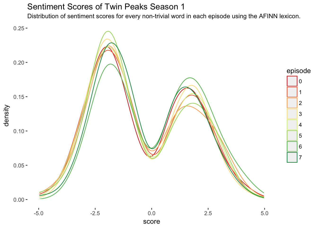
The main problem with this plot is it gives the impression that sentiment scores are continuous numeric variables between -5 and 5 when in fact they are discrete. Although the twin-peak-shape of the continuous density curves (in every episode!) is irresistible and slightly mind blowing, the following plot is more appropriate.
ggplot(s1, aes(x = score, fill = episode)) +
  geom_histogram(breaks = -5:5,stat = "count") +
  theme(panel.background = element_rect(fill = "white")) +
  ggtitle("Sentiment Scores of Twin Peaks Season 1") +
  labs(subtitle =
         "Count of sentiment scores for every non-trivial word in each episode using the AFINN lexicon.") +
  scale_fill_brewer(palette = "RdYlGn") +
  scale_x_discrete(limits = -5:5)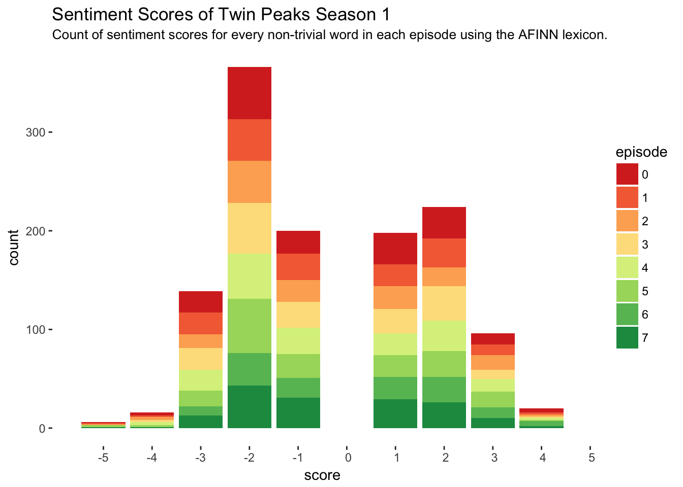
We still get the awesome twin-peak-shape in this curve and it is much more precise. This histogram is showing the number of times each score appeared in the entire season, with each bar colored in proportion to how much of that total count was contributed by a certain episode. While the first plot lacks in precision, it certainly beats the second plot in interpretability.
I’d like to incorporate some more information into a plot now along with sentiment scores, namely episode number and the frequency of words. To do this, I’ll filter out the top 5 most frequently occurring words in each episode’s transcript and plot the word’s frequency in relation to its sentiment score. This will give some clues as to how the most frequently used words differed in sentimentality across episodes.
s1 %>%
  group_by(episode) %>%
  top_n(n = 5, wt = n) %>%
  ungroup() %>%
  ggplot(aes(x = word,y = score,size = n,color = episode)) +
  geom_point() +
  scale_color_brewer(palette = "RdYlGn") +
  facet_wrap(~ episode,scales = "free_x") +
  theme(panel.background = element_rect(fill = "white"),
        strip.background = element_rect(fill="white"),
        strip.text = element_text(color = "white"),
        axis.text.x  = element_text(size = 6),
        axis.text.y = element_text(size = 6)) +
  scale_y_discrete(limits = -4:4) +
  ggtitle("Top 5 Words by Frequency with Sentiment Scores in Twin Peaks Season 1 ") +
  labs(subtitle =
         "Some episodes include more than 5 because of ties.")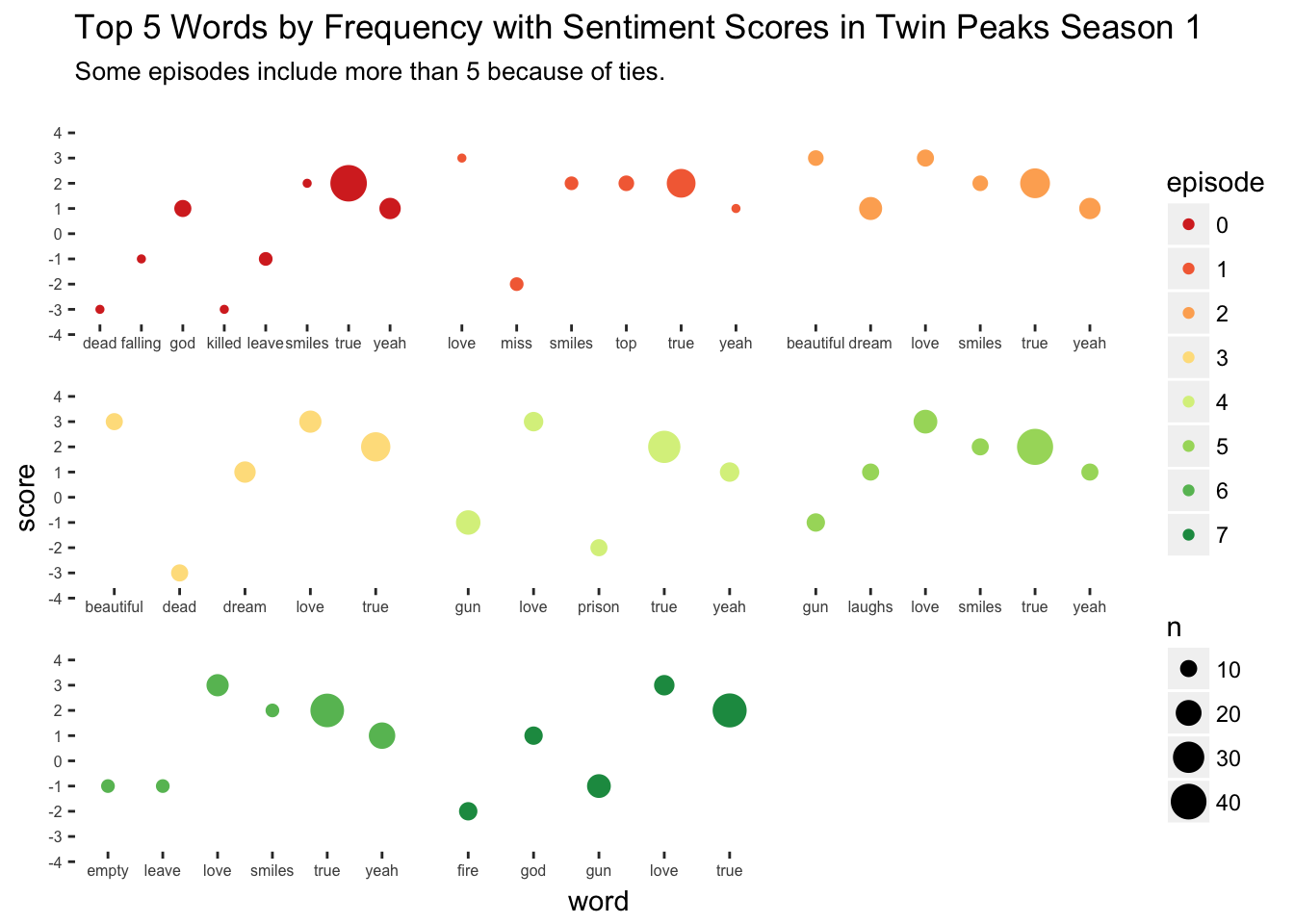
In this plot, each episode’s top five words (often more than five because of ties) are given their own facet position and color. Within in facet, the top five words are listed on the horizontal axis, with their corresponding sentiment score on the vertical axis and the size of the point proportional to the word’s frequency in that episode. From this plot we can see that the pilot episode, where we are introduced to Laura Palmer’s death, contains some dark and heavy language. In contrast, Episode 2 Zen, or the Skill to Catch a Killer contains some surprisingly pleasant language despite the episode title. Also, I find it interesting that “love” is a top word in every episode except the pilot.
The last visualization I will attempt will look at the over all sentiment of each episode, measured by the sum of all sentiment scores in that episode. In the following plot, we have a column chart with the horizontal axis corresponding to the episode number and the vertical axis corresponding to the sum of scores in that episode. Note here that the sum of scores is computed by \(\sum n \times score\) for each row in the s1 data frame.
s1 %>%
  group_by(episode) %>%
  summarise(score_sum = sum(n*score),
            num_words = sum(n)) %>%
  ggplot(aes(x = episode, y = score_sum, fill = num_words)) +
  geom_col() +
  geom_hline(yintercept = 0,color = "grey") +
  theme(panel.background = element_rect(fill = "white")) +
  scale_fill_distiller(palette = "RdYlGn") +
  ggtitle("Overall Sentiment Score of each Episode in Twin Peaks Season 1") +
  labs(subtitle = "Fill color corresponds to the number of words in that episode")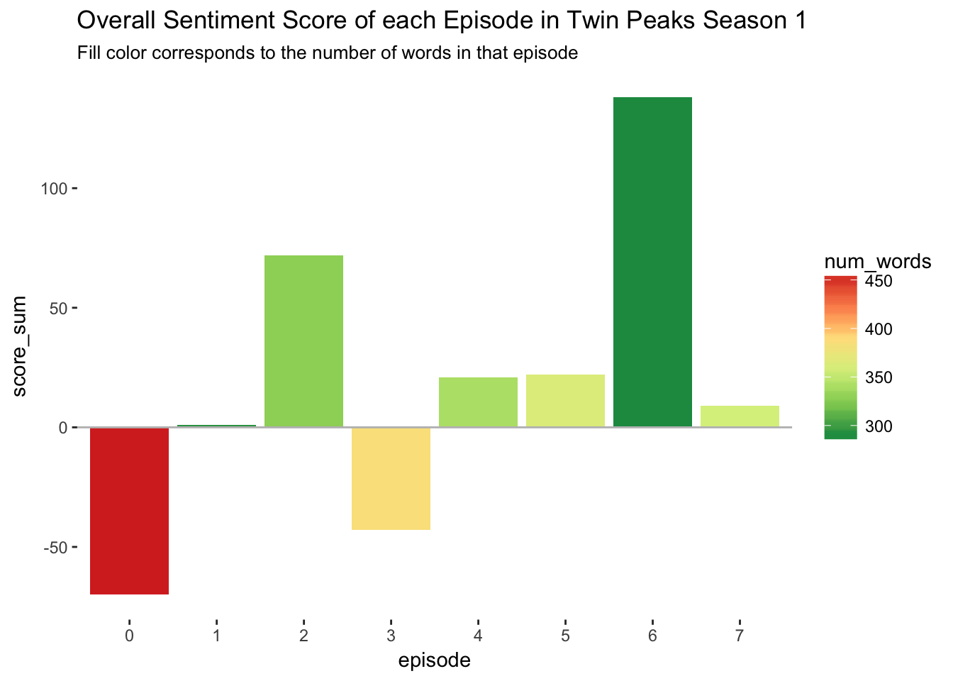
Interestingly, there were only two net-negative episodes in the whole season. The pilot episode is the overall most negative episode, not too surprising since this is the episode that reveals Laura Palmer’s murder. The other net-negative episode, Episode 3 Rest in Pain, contains (among other things) negative events like the dispute over Laura Palmer’s autopsy, Laura Palmer’s funeral, and Agent Cooper’s revelation that there is an unexplainable darkness permeating Twin Peaks.
Topic Modeling Using Latent Dirichlet Allocation
To take this analysis a bit further, I wanted to try out some topic modeling as described in Chapter 6 of Silge and Robinson. In particular, I’d like to do a Latent Dirichlet Allocation (LDA), which will find k “topics” in the text of season 1 using \(\beta\), or per-topic-per-word probabilities.
The first step is to recast the tidy data frame s1 as a DocumentTermMatrix object, which I will call s1_dtm.
s1_dtm <- s1 %>%
  tidytext::cast_dtm(episode,word,n)
Now the s1_dtm matrix is supplied to topicmodels::LDA() to make a model object. I will set k=8, because we have eight episodes in the season. I would like to see what an alternative eight episode season might have looked like if it was LDA writing and directing!
library(topicmodels)
episodes_lda <- LDA(s1_dtm,k = 8)
Next we can tidy up the output of the LDA model with tidy().
episode_topics <- tidy(episodes_lda,matrix = "beta")Now I’ll grab the top 3 words (including ties) in each topic defined by LDA.
top_terms <- episode_topics %>%
  group_by(topic) %>%
  filter(term != "true" & term != "yeah") %>%
  top_n(3,beta) %>%
  ungroup() %>%
  arrange(topic,-beta)
And finally, plotting the results.
top_terms %>%
  mutate(term = reorder(term, beta)) %>%
  ggplot(aes(term, beta, fill = factor(topic))) +
  geom_col(show.legend = FALSE) +
  facet_wrap(~ topic, scales = "free") +
  coord_flip() +
  scale_fill_brewer(palette = "RdYlGn") +
  theme(panel.background = element_rect(fill = "white"),
        strip.background = element_rect(fill="white"),
        strip.text = element_text(color = "white"),
        axis.text.x  = element_text(size = 6),
        axis.text.y = element_text(size = 6))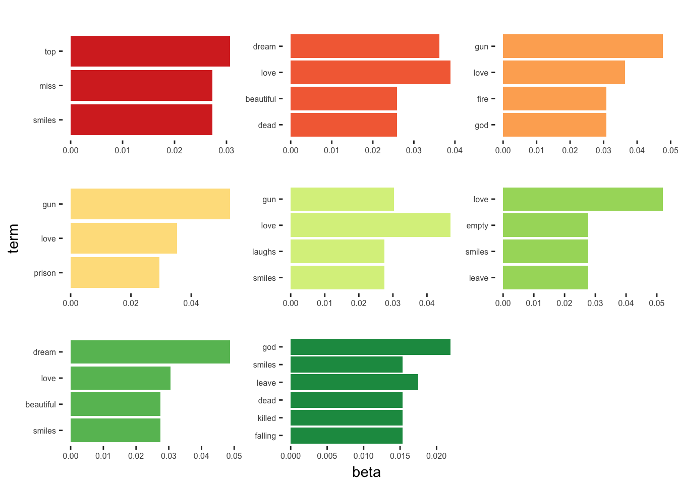
I’m not sure how much insight this gives us, but it’s interesting to see what the algorithm came up with. Personally, I’m glad it was Lynch and Frost behind the scenes instead of LDA.
Concluding Remarks
Overall, I think there were some surprising results from this analysis. For one, I am surprised how the sum of sentiment scores in each episode - a measure of the overall sentiment of that episode - were so low, despite many of the top words in each episode being so positive (“love”,“true”,“dream”,etc…). Interestingly, this get’s at one of the reasons I and many others like the show so much. The blend of beautiful characters and themes against a backdrop of such darkness and evil is something that I think makes the show truly special. I’m excited to see if any other ideas come from this analysis, but at the very least, it was a nice way to get started with tidy text analysis!